Too Long; Didn't Read?
Passing networks today are presented as static images, which leads to important insights being lost. By unlocking the added dimension of interactivity, and by critically thinking about the metrics they encode, we can make passing networks much more valuable for tactical analysis. Click here to jump straight to the interactive passing networks!
A team "without soul or joy"
Passing is undoubtedly one of the most important components of any football team's play, but it's often oversimplified during match analysis. Take, for example, Spain's loss to Russia in the 2018 World Cup Round of 16. Spain completed over 1,000 passes and had 74% of the ball, yet they could only manage to force in an own goal from a set piece in 120 minutes. Spanish newspaper Marca called their own national team one "without soul or joy", while also rightly pinpointing their "sterile domination" in the Russia game.
#LaPortada Andando a casa pic.twitter.com/KyYY9Z5jjU
— MARCA (@marca) July 1, 2018
So how does one go about debugging this sterile domination? Where did it go wrong for Spain? Why couldn't more than 1,000 passes generate more than just one (own) goal? If you were to play Spain tomorrow, how would you set up against them to ensure their domination remains ineffective? How should you train in preparation to play Spain? And if you're Spain, what do you need to do differently on the training ground?
These are the types of questions that analysts are often faced with, and I'd like you to put yourself in their shoes for the rest of this post. Note that analysts at professional clubs will have to answer such questions for not just their own team, but also their upcoming opposition, by looking at weeks' if not months' worth of matches, all before their team starts training for the match on the weekend.
The state of passing networks
Passing networks, while not common in the mainstream media yet, are a popular visualization amongst football analysts that are used to study a team's passing patterns in a particular match. They're called 'networks' because they fundamentally represent mathematical networks; a passing network consists of a set of 'nodes' (i.e. players) that are connected to each other through 'edges' (i.e. passes). Networks are incredibly useful across several domains, since many real-world environments can be modelled as networks. For example, while studying social networks, nodes could represent users and edges could represent the number of times they've messaged each other. Or, while solving problems in the transportation domain, traffic intersections could be modelled as nodes, and the roads connecting them could be modelled as the edges.
Sounds useful — can Spain's passing network against Russia tell us anything about why they were so ineffective with the ball? Here's an auto-generated passing network from the Twitter account, @11tegen11:
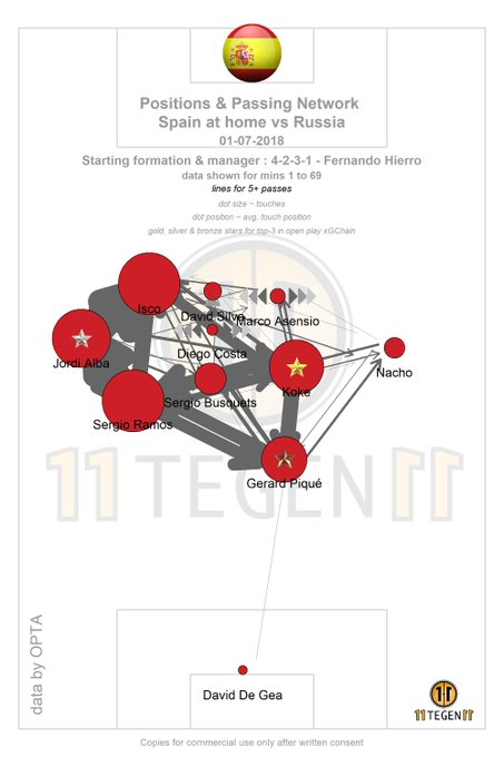
There's a lot going on here, so here is a breakdown of the elements that make up this visualization:
- Direction: Spain is attacking from the bottom to the top of the map.
- Nodes: each circle (i.e. node) represents one of Spain's players; the larger the node, the more ball touches that player had.
- Node positions: the position of each player is the average of the places where they registered ball touches.
- Edges: the directed arrows (i.e. edges) between players represent the number of passes between them; the thicker the edge, the more passes were exchanged.
- Stars: there are stars on some players, but you can ignore them for now (I will address them later).
Even after an explanation, this is an overwhelming visualization packed with so much information that it is quite ineffective. From a design perspective, with a static image, there's an inherent trade-off between representing more information and reducing visual clutter.
Towards better passing networks...
| # | Player |
|---|---|
| 1 | David de Gea |
| 3 | Gerard Piqué |
| 4 | Nacho |
| 5 | Sergio Busquets |
| 8 | Koke |
| 15 | Sergio Ramos |
| 18 | Jordi Alba |
| 19 | Diego Costa |
| 20 | Marco Asensio |
| 21 | David Silva |
| 22 | Isco |
To help us out a bit, shown above is Spain's passing network with a few key design differences. You might find this version easier to digest, and you can start to notice some patterns:
- Spain's clear 4-2-3-1 formation, with Sergio Busquets and Koke forming the 2-man midfield base.
- The prominence of tiki-taka triangles, such as the one between Sergio Ramos, Jordi Alba and Isco on Spain's left.
- A general bias towards attacking on the left: Jordi Alba and Isco see many more passing interactions compared to Nacho and Marco Asensio on the right.
What changed?
Here's a summary of the design differences, along with justifications for each decision:
- Spain is attacking from the left to right.
- As has been argued by StatsBomb's Ted Knutson, the left-to-right representation maps to a much more familiar mental view of football games, given that we are all so accustomed to watching teams move horizontally across our screens.
- All node sizes are equal.
- Number of touches are approximately (but not exactly) proportional to the number of passes received and given, and given that the edge thickness already encodes the latter, I believe it is okay to make node sizes equal to free up some real estate on the screen without losing much information.
- Our eyes seem to naturally gravitate towards the nodes with high edge degrees (i.e. thick edges), even if node sizes are all equal.
- The position of each player is the average position at which they received or gave passes, as opposed to average touch position.
- The differences due to this change are small, because most of the touches that a player makes are in between an incoming and an outgoing pass anyway. The exceptions to this are the times when a player receives the ball through some medium, but fails to relay it onwards to a teammate successfully. Some examples of this are losing the ball while dribbling, making a defensive clearance, shooting from a free-kick/penalty, failing to pass from a corner.
- This decision was partly down to me not having fine-grained touch data, but also because passing networks are all about passes. If the edges are representing passing interactions, then the nodes should also represent the same passing interactions, and not extraneous data points that were not part of passing sequences.
- The edge thicknesses are normalized, i.e. the thickest edge in a passing network is always drawn with some width, and other edge thicknesses are scaled accordingly.
- This is to deal with the glaring problem in the original Spain passing network, where the edge thicknesses grew unboundedly and hid other important information.
- Note that this decision may not be a good one while comparing, for example, the passing networks of the two teams in a match. Such normalization would make it appear as though both teams completed roughly the same number of passes, which is not always true. In such comparative cases, it would be better to normalize all the edges from both passing networks together, rather than as two separate sets of edges.
- Instead of labelling each node with the player names, we use jersey numbers.
- This is mainly done to reduce the clutter in the image and free up some space.
- A key is included if one would like to look up player names.
A picture is worth a thousand passes?
If this is your first time seeing passing networks, you are hopefully fascinated by them. They are indeed a neat tool to concisely visualize a team's shape and get a basic sense of their passing channels over the course of a match. However, when you start looking at these from the point of view of a tactical analyst, the utility of passing networks maxes out very quickly.
The insights that you can draw from this single image are very limited. In fact, the insights listed above are insights that any spectator who's paying attention to the match would be able to pinpoint with ease. Surely we can do better when we have more than 1,000 pass data points, each of which has several attributes?
Productizing passing networks
The key insight to making passing networks more useful is thinking critically about the information they encode. We know from above that it's quite hard to squeeze information through these visualizations without making them overwhelming and hard to interpret. But if we focus on turning passing networks into a product that is useful for tactical analysis, can we be smarter about the information that we show?
Focusing on the user
Once we start to narrow down the scope of our new passing networks, we start to break free from some of the limiting constraints and have more room to experiment. If we intend to create passing networks that are more useful to fans and professionals looking for tactical insights, what kind of questions should the visualization be able to answer? Imagine yourself in your favourite team's manager's shoes, trying to figure out how your team should act without the ball in your next match. What would you like to know about your opponents that would help you prepare for the game?
By no means is this a definitive list, but here are some questions that would (potentially) be useful to answer:
- Which players are central to their attacking buildup?
- Are there particularly dangerous partnerships we should aim to break down during their attacking buildup?
- Which of their players are less productive with the ball?
- Do they look to play long balls to certain players?
- Do they have a tendency to switch play?
- ...
This is already a list of very varied questions, and it is far from being comprehensive. Every team, based on their own strengths and weaknesses, might want to know the answers to a different set of questions. However, one common thread ties these questions together: they are all related to how the opponents act when they have the ball, which means that a lot of the answers are encoded in their passing behaviour.
Not all passes are created equal
Uncovering the insights that could answer these questions requires us to carefully think about the anatomy of a single pass. Each pass has some attributes associated to it: for example, its start and end locations on the pitch, the players involved, and its length, duration, angle, height, among other properties. The typical passing network (reproduced below) treats every pass as being equal. Each pass, regardless of its nature, contributes evenly to this visualization.
| # | Player |
|---|---|
| 1 | David de Gea |
| 3 | Gerard Piqué |
| 4 | Nacho |
| 5 | Sergio Busquets |
| 8 | Koke |
| 15 | Sergio Ramos |
| 18 | Jordi Alba |
| 19 | Diego Costa |
| 20 | Marco Asensio |
| 21 | David Silva |
| 22 | Isco |
This is not to say that this visualization is useless; in fact, for the most general use case of presenting data on a Twitter feed, this is perfect. It is intuitive (thickness of line = number of passes), and can even answer some questions such as "which of their players sees the most of the ball?" which in turn might lend some insight into who you should man-mark to disrupt their usual passing flow.
However, we want to be able to answer more than just that one question if we want to really enable in-depth tactical analysis. In the original passing network, one can think of each pass (regardless of its attributes) as carrying a value of 1. Things start to get very interesting when we change the value of passes based on their attributes, in a way that highlights the answers to our questions. We suddenly start to uncover hidden patterns that a single image just isn't able to capture.
Answering questions by choosing weighting schemes
Given a particular question we would like to answer about a team's behaviour with the ball, we can come up with a weighting scheme that values certain passes higher than others, such that our desired patterns are highlighted.
-
Which players are central to their attacking buildup? / Are there particularly dangerous partnerships we should aim to break down during their attacking buildup?
Our original passing network cannot answer this question sufficiently, the reason being that it does not take into account the 'attacking value' of passes into account. To answer this question, we can value a pass based on how much better of an attacking position the team is in due to the pass. To keep this concise, I won't go into too many details here, but in short this is based on computing an estimated attacking potential of each location on the pitch. Once we have such a map, we compute the value of a pass as the attacking potential of its end location minus the attacking potential of its start location, i.e. the incremental attacking potential that was gained due to this pass.
Note: this might at first seem similar to the xGChain and xGBuildup passing networks introduced by StatsBomb. However, those metrics rely on the assumption that each pass should be valued based on the end outcome of the possession (i.e. it depends on whether or not a shot was eventually taken). I believe that we can do much better by treating individual passes as being independent from the end outcome of the move. Firstly, clearly an innocuous pass between the centre-backs that eventually happened to lead to a shot should not be given substantial credit for the eventual shooting position — it itself did not enable that situation. Secondly, football is so stochastic; players sometimes shoot when they perhaps shouldn't, or don't shoot when they should, and attributing pass values based on this end outcome is not very stable. While the model I'm using is not perfect either, we can gain more reflective insights by treating passes as independent entities within a move. I'll write more about this process in a different post!
Another note: the stars on the auto-generated passing network from Twitter that I told you to ignore earlier are trying to pack xGChain information into passing networks. The top 3 contributors in terms of xGChain are marked with gold, silver, and bronze stars. While I don't think xGChain is as reflective of true player threat because of the reasons mentioned in the above note, I think it is best to visualize it separately in its own passing network, as is done in the StatsBomb post linked above.
When we redraw our passing network to weight the passes according to their attacking value, we start to see why Spain struggled to score against Russia. Shown below is our new, custom, attack-weighted passing network.
# Player 1 David de Gea 3 Gerard Piqué 4 Nacho 5 Sergio Busquets 8 Koke 15 Sergio Ramos 18 Jordi Alba 19 Diego Costa 20 Marco Asensio 21 David Silva 22 Isco
One pattern immediately stands out. The unweighted passing network told us that Spain's passes were mostly concentrated on the left side, yet their attack-weighted passing network tells a different story. For all of Spain's buildup play on the left, they lacked the penetrative power to play dangerous passes. Apart from some of Isco's passes to Diego Costa, Spain's left was largely ineffective — the first symptom of "sterile domination." Instead, it was their right side that actually showed signs of productivity, despite having far less of the ball. The chain formed by Nacho, Asensio, and Costa in particular seemed to have generated a lot of attacking value.
In summary, our attack-weighted passing network tells us that Isco and Asensio were the most central and productive players in Spain's attacking buildup. Isco particularly not only put Costa in good positions, but also made himself available to other players like Koke and Alba in positions that advanced Spain's play. Asensio was productive with the ball, but seems to have enjoyed far too less of the ball to make any real impact on the game. If we were to focus on breaking down certain attacking partnerships, it might make sense for our defenders to stay close to Costa when either Isco or Asensio have the ball at their feet.
Unfortunately for Spain, their attacking efforts were not enough to break down a stubborn Russian defence. Based on what we have so far, we might start to piece together some more questions to look into. David Silva is known to be especially productive with the ball, and looking at the unweighted and attack-weighted passing networks, he barely made his mark on the game. Why was that? Similarly, Spain's right was productive with the ball, but why weren't they given more of the ball? -
Which of their players are less productive with the ball?
As an opposition analyst, answering this question might help us strategize our pressing efforts. Which players should we focus on closing down quickly, and which ones should we not expend as much energy on? There are a couple of ways in which we can construct a pass weighting scheme to highlight such players. One way to achieve this is to take our attacking value metric and negate it, so as to highlight the players that found themselves in threatening areas, but from these areas often made passes that reduced the team's threat. Here is the defence-weighted passing network that we obtain with this metric.
# Player 1 David de Gea 3 Gerard Piqué 4 Nacho 5 Sergio Busquets 8 Koke 15 Sergio Ramos 18 Jordi Alba 19 Diego Costa 20 Marco Asensio 21 David Silva 22 Isco
Alba to Ramos is the standout link, and we can start to fit the puzzle pieces together. From the attack-weighted passing network, we saw that Alba wasn't very productive even though he had a lot of the ball. Looks like he was often forced into playing it backwards to Ramos or Busquets, likely because Russia were effectively able to cut his passing channels to Isco and Silva.
Another standout is Koke, specifically the number of inbound arrows towards him. This points to the fact that players like Isco, Silva, and Asensio played the ball backwards to Koke, who made himself readily available to them in case they were unable to find ways through the Russian defence. We can infer that the attacking midfielders frequently used this option of playing it backwards to Koke because they couldn't find options for that final pass from promising situations.
This is useful information not only for opposition analysts, but also performance analysts and coaches who want to increase their team's productivity. However, note that this defence-weighted passing network looks specifically at when attacking potential was lost, which means that it can only highlight players who were able to find themselves in threatening positions in the first place (and subsequently passed to non-threatening positions). But in most cases, the problem starts well before the ball reaches threatening positions — it might help us to pinpoint players whose passing behaviour points to either a lack of creativity or a lack of available options. Recognizing players that are often playing the ball sideways or even backwards can be a good first step to improving the team's productivity when in possession.
A simple way of doing this is by weighting passes according to the angle that they make with the attacking direction. Passes that are roughly 'forward' can be assigned low weights, while backward passes can be assigned high weights. This instantly gives us a sense of which players had a strong tendency to pass backwards instead of finding options in front of themselves. Shown below is the resulting backwards-weighted passing network.
# Player 1 David de Gea 3 Gerard Piqué 4 Nacho 5 Sergio Busquets 8 Koke 15 Sergio Ramos 18 Jordi Alba 19 Diego Costa 20 Marco Asensio 21 David Silva 22 Isco
Note: using the start and end locations of the pass, we can compute the angle that the pass makes relative to the forward, attacking direction. This value ranges clockwise when looking at the left-to-right pitch; an angle of 0 means the pass was made in a horizontal line towards the opposition goal, while an angle of 180 corresponds to an exactly backwards pass. We cannot simply take the raw angle as the pass value, because the angles range from 0 to 360, falling anywhere in the full circle of possible directions. Instead, we take the negative cosine of the angle, which gives us -1 for forward passes, 0 for passes to either side, and 1 for backward passes, hence highlighting players that made a lot of backward passes.
This is very similar to what we saw before with the defence-weighted passing network, with a couple of added insights. Two new edges stand out: Koke to Piqué, and Isco to Ramos. These links did not show up earlier, which means that although these were backward passes, they were not made from threatening positions (so as to worsen the team's position). This likely means that Koke and Isco looked for their centre-backs during the early stages of Spain's buildup play, when the ball was still far from being in a dangerous position. We can start to see that Russia's compact and disciplined defence really did starve Spain's midfielders (usually known for their creativity) of passing options, forcing them to start from the back repeatedly.
The backwards-weighted passing network, however, does not tell us much about sideways passes. Though sideways passing can sometimes be productive (by drawing defenders out of shape) as part of a planned tactic, it is more frequently viewed as a largely futile exercise. We can render a new sideways-weighted passing network that weights flat passes to either side more strongly than passes that are either forwards or backwards.
# Player 1 David de Gea 3 Gerard Piqué 4 Nacho 5 Sergio Busquets 8 Koke 15 Sergio Ramos 18 Jordi Alba 19 Diego Costa 20 Marco Asensio 21 David Silva 22 Isco
Note: to upweight sideways passes, we want to upweight passes that subtend 90 and 270 degree angles with the horizontal attacking direction. We can take the squared sine of the angle to achieve this, since forward (0 degrees) and backward (180 degrees) passes will result in a weight of 0, while left (90 degrees) and right (270 degrees) passes will result in a weight of 1.
There are two standout partnerships here that registered the most sideways passes. It's not just the two centre-backs (as you might expect), but also the Ramos-Koke link that was big on sideways passes. Piecing the three custom passing networks from this section (defence-weighted, backwards-weighted, and sideways-weighted), we can see that Koke stood out on all three fronts. He received a lot of passes in midfield from attackers in threatening positions, frequently passed backwards to Piqué, and often looked sideways to Ramos. -
Do they look to play long balls to certain players? / Do they have a tendency to switch play?
As far as long balls go, there's two common patterns that one might see. The first is frequent switches in play, where the team creates an overload on one flank, only to switch play quickly and exploit open space on the other flank. The second is the more traditional target man approach, where direct long balls are played into a physical striker who can then create opportunities for either himself or those around him. We can use a simple pass weighting scheme that values longer passes more than shorter passes, and we get a long-ball-weighted passing network.
# Player 1 David de Gea 3 Gerard Piqué 4 Nacho 5 Sergio Busquets 8 Koke 15 Sergio Ramos 18 Jordi Alba 19 Diego Costa 20 Marco Asensio 21 David Silva 22 Isco
This one is a little subtle for Spain, but if you look closely, you should be able to spot some play switching going on. Specifically, Nacho receives a lot of left-to-right switches from Ramos and Isco. The edge between Koke and Alba is also indicative of some right-to-left switching, though it's not as prominent as the left-to-right switching. Spain are known to form overloads on one flank through intricate passing triangles, only to switch play rapidly and exploit open space on the other flank. While they seem to have tried that briefly, especially switching from the possession-dominant left to the possession-starved right, it appears as though Russia was able to nullify this tactic by not getting drawn out of their strict defensive shape.
On a related note, one might also ask why Diego Costa, who is known to be a very effective target man at the club level (for Chelsea and Atletico Madrid), was not fed long balls when Spain's Plan A was clearly being neutralized. With passing networks, it's not just the thickest edges that carry insight, but also the thinnest (and absent) edges that can raise questions.
Passing networks are a flexible tool
Clearly, passing networks provide an easy-to-modify framework that can be used to gain insights into several tactical questions, by simply encoding the relevant metrics in the pass weights. The questions (and corresponding pass weighting schemes) I proposed above are a small subset of the questions that an analyst might want to answer. There is a whole universe of questions that one might ask about how a team behaves with the ball, but the concept of a passing network is so powerful that you can uncover many of these answers by tweaking the encoded metrics.
The downside is that no single static passing network visualization can capture the wealth of information that is buried in the data. Trying to pack all of these differently-weighted passing networks into a single image is inevitably going to lead to cluttered and unusable visualizations. Moreover, each weighted passing network can be weighted to different extents, so that one can highlight a varying number of strongest partnerships. To empower analysts with truly useful passing networks that they can freely explore and draw insights from, we have to go beyond 2-dimensional images.
Beyond 2D passing networks
There are two main requirements for this new type of passing network visualization:
- Flexibility of metrics: to enable answering different kinds of questions, we must make different weighting schemes available to the user. In an ideal world, they would also be able to define their own custom pass weighting functions (to explore more intricate patterns and answer more complex questions).
- Flexibility of degree: users should be able to control how much they would like to upweight the high-value passes. Whether an analyst wants to highlight the top-5 attacking passers, or would prefer a more sparse graph that highlights just the top attacking passer, they should be able to control this. Through my own experiments during development, I also believe that being able to control this highlighting degree enables the user to see interesting patterns that a snapshot at an arbitrarily-chosen degree might not convey. I tried to compile snapshots at varying degrees into a GIF, but the amount of information held in those frames was so much that I found myself pausing for certain frames anyway.
All together now
Here is a first attempt at packaging different insights in the form of an interactive tool that can be used for in-depth passing network analysis. Use the tabs to switch between pass weighting metrics, and use the slider to control the degree of weighting.
Spain v Russia
| # | Player |
|---|---|
| 1 | David de Gea |
| 3 | Gerard Piqué |
| 4 | Nacho |
| 5 | Sergio Busquets |
| 8 | Koke |
| 15 | Sergio Ramos |
| 18 | Jordi Alba |
| 19 | Diego Costa |
| 20 | Marco Asensio |
| 21 | David Silva |
| 22 | Isco |
Included below are the interactive passing networks for England's near perfect 2-0 World Cup quarter-final win against Sweden, and Germany's wretched 1-0 group stage loss to Mexico. Feel free to play around with these widgets, and let me know if you're interested in seeing particular teams or matches!
England v Sweden
| # | Player |
|---|---|
| 1 | Jordan Pickford |
| 2 | Kyle Walker |
| 5 | John Stones |
| 6 | Harry Maguire |
| 7 | Jesse Lingard |
| 8 | Jordan Henderson |
| 9 | Harry Kane |
| 10 | Raheem Sterling |
| 12 | Kieran Trippier |
| 18 | Ashley Young |
| 20 | Dele Alli |
Germany v Mexico
| # | Player |
|---|---|
| 1 | Manuel Neuer |
| 2 | Marvin Plattenhardt |
| 5 | Mats Hummels |
| 6 | Sami Khedira |
| 7 | Julian Draxler |
| 8 | Toni Kroos |
| 9 | Timo Werner |
| 10 | Mesut Özil |
| 13 | Thomas Müller |
| 17 | Jérôme Boateng |
| 18 | Joshua Kimmich |
A team "without soul or joy" without a Plan B
Back to our original question, all the evidence points to Spain's Plan A being neutralized by Russia. Spain were allowed to play their tiki-taka triangles on the left, but they were unable to exploit spaces as they normally do through switches in play and shifting the ball centrally. Russia were able to starve David Silva and Diego Costa of the ball by cutting off the passing channels to them, forcing Spain to play innocuous passes amongst the trio of Alba, Isco and Ramos. When they did find themselves in potentially threatening positions between the lines, Russia's compact defence cut out their options and forced backward passes to the likes of Koke and Ramos, who, devoid of creativity and attacking options, resorted to passing the ball sideways. Spain, without an obvious Plan B, deserved to be knocked out.
Let's talk!
I'm yet to set up a comments section for this blog, but I would love to hear any thoughts or feedback you might have. Please email me at karun.singh17@gmail.com or message me on Twitter at @karun1710!